
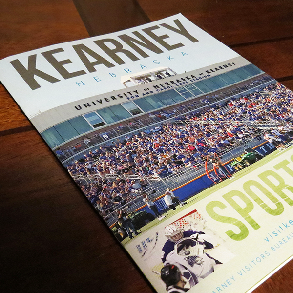
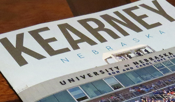
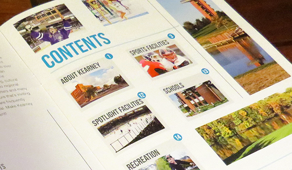
The Kearney, Nebraska Visitors Bureau showcases the community’s exciting attractions and family-friendly activities. While the Bureau had established some brand standards, such as the recognizable “K” logo, there were inconsistencies in how the logo, colors, and graphic elements were used. By revising and refining the brand standards, marketing materials now convey Kearney’s message with consistency. Given the area’s youthful vibe, I introduced bold colors as highlights and strong geometric graphics to convey the ideas of “family fun” and “travel.” The main challenge was to use these elements appropriately across various materials for different audiences. For instance, the Rack Card is vibrant and colorful to attract families to Kearney, while the Sports Guide is more subdued, focusing on providing informational content.