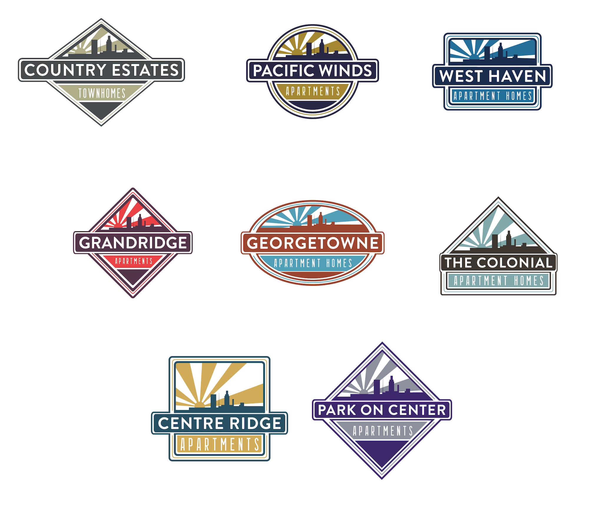
Managing 8 properties in the Omaha area posed a challenge due to inconsistent branding and messaging across the region. Through collaboration on a graphical representation of the city, I unified each individual community under one cohesive look. I redesigned each mark and color palette to maintain their distinctiveness while being recognized as part of a unified region. The pastel colors used in each logo reflect the beautiful Nebraska sunset, portraying a calm side of the city while remaining bright to showcase its desirability as a place to reside. This cohesive branding approach enhanced all collateral and platforms, fostering a stronger connection with the region.
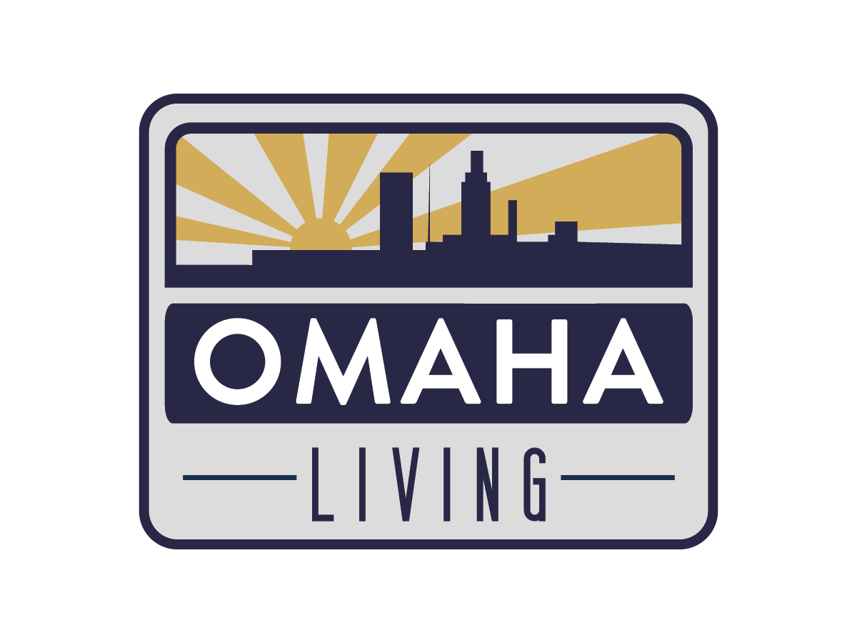
This effort extended to the regional website design and the creation of the “Omaha Living” regional logo. The regional website was designed as a hub for prospects looking in the area to quickly learn about each community and find out which one they want to explore further. The website content highlights each property’s amenities and neighborhood area.
Individual Community Logos